Know the End in the Beginning, Building Bindery In Design
Know the End in the Beginning, Building Bindery In Design
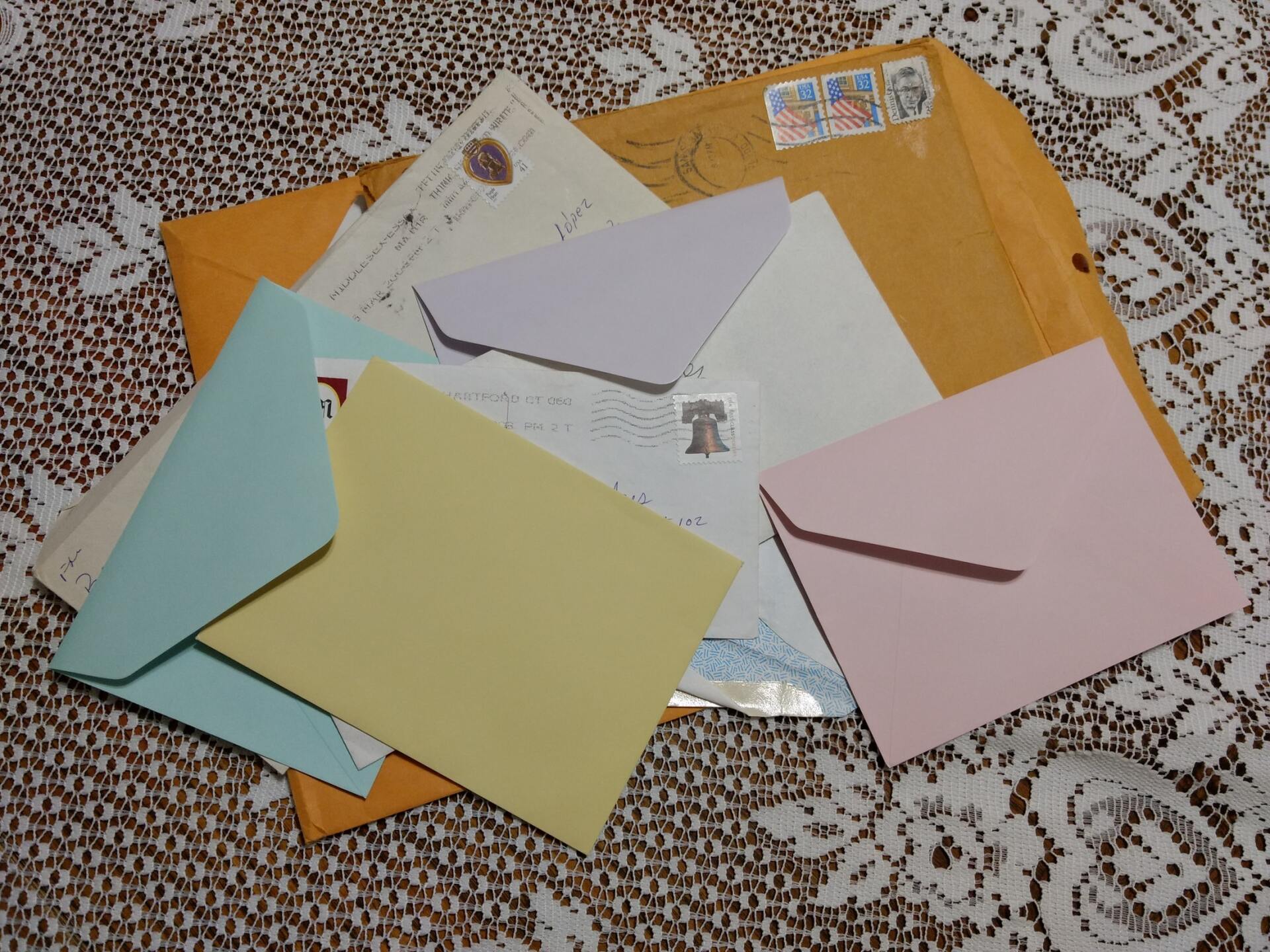
Print Buyers beware….
You wouldn’t wait until you’re getting the keys to your newly built house to tell the architect and contractor that you want a walk-in pantry in the kitchen and a wood burning fireplace in the master bedroom. Those features need to be planned. Space needs to be allocated. Materials ordered and inspections completed. Those features need to be considered and incorporated into the design of the project not managed at the end. It’s not like you asked to change the color of the exterior paint. A walk-in pantry would require tearing out walls and completely redesigning the floor plan.
In the same way, a finished printed product must be fully defined at the beginning of the projects. Even somethings as simple as an envelope, a fold-over business card, or a booklet may have finishing issues that need to be considered and included in the design and preparation of the art.
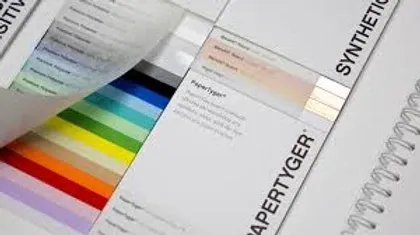
Books, booklets, magazines, presentation folders, and even brochures or fold over business cards may have tricky elements that need to be addressed in the design. As print buyers you are ultimately responsible for the outcome of the printed document and you need to be aware of the red flag warnings that indicate a problem might be on the horizon. There are end stage processes that must be addressed in the beginning. If you’re working with in-house or contract designers who haven’t even asked how the product will be used, what kind of paper it will be printed on, what types of environmental conditions the product will be exposed to or what bindery will be needed to complete the project, then they are probably exposing you to some future headaches or the possibility that the job will need a costly rerun. A designer who neglects to incorporate all the finishing issues of a printed product is like an architect that doesn’t bother to find out if you want the walk-in pantry and fireplace. You should recognize this as a red flag warning.
Print design is different from web design. If a web image looks great on your computer it will probably look great on everyone’s computer and as long as the image is responsive it will even look awesome on notebooks and smart phones, but we’re talking about a printed document, a product in the physical world. A product that has weight and substance. Print products go through several unique stages in the process of become an acceptable finished object. First it is designed and proofed, then printed, then subjected to a variety of bindery processes, including trimming, scoring, folding, assemble, gluing, stapling, drilling, and mailing processes. This is where the traps are and if the designer does not anticipate these pitfalls, the finished product is apt to be a disappointment.
If the person doing the design is not aware of ALL the print and bindery concerns, the art might not be laid out correctly. This is a huge challenge because design and art are the first steps, but bindery and mailing are end-stage processes. Adding to the problem is that many people who work on design, don’t even prepare their files correctly for the printing process and have even less knowledge of, or concern for bindery. Some designers are consumed with how the design looks on the computer, and as long as that is acceptable and approved by you or the client then their work is done. But it’s not! As a print buyer, if you sign off on the design you’re assuming the responsibility and the risk for everything that happens after the designer releases it to you, so you need to make sure they have considered and incorporated all the finishing elements of the project.
Case Study: Mailing Panel. I had one client who signed off on a design for 80,000 folded full color brochures that were to be mailed to the client’s database. As their print broker, I knew that we needed both the bindery and the post office to sign off on the design. As it turned out the brochure folded in such a way that it could not go through the automatic scanner at the post office, and even if it could, the address block was in the wrong place. Fortunately, we had an opportunity to correct these design issues before the document was printed, folded, sealed and delivered to the post office, where it surely would have been rejected. By-the-way, the post office reserves the right to discard bulk mail that does not conform to its mailing standards. I doubt they would have thrown away 80,000 United Way brochures but with the fold and the address block in the wrong place, we would have needed to reprint it, anyway.
Incomplete design issues could be (and probably should be) the subject of a separate blog post but for this discussion, please understand the importance of harmonious relationship between design and bindery. Design incorporates bindery concerns, but bindery must perfectly execute the design, to produce the desired finished product. Both are important and neither is more important than the other.
Case Study: Roll Fold Brochure. Let me give you another example. We worked with a highly skilled designer who was creating a roll fold brochure for a client, that we shared. It was my job to take her design and print thousands of these full color brochures. There was no room for error. Any art, printing, or bindery misstep would have resulted in a costly rerun.
When finished the brochure would be 5” x 5”, but flat it was 25” by 5” and it had 4 folds. The paper was a thick coated cover stock and with each fold the brochure became thicker. Because of this, the exact width of the inner panels was different from the outer panels. This small difference between the panel widths was significant because the designer used full color blocks that changed color at the fold of each of the 10 panels (5 panels on one side and 5 panels on the other side) and each of those intersections of changing color had to line up exactly on the fold line or the product would be completely unacceptable to the client. The designer and I worked together with the bindery to calculate the exact size of each panel. We took the actual paper that would be used for these brochures and asked the bindery to create a prototype of the finished brochure. The designer then measured each panel and built her art to fit the bindery sample. The finished brochures were perfect, but they would not have been so without incorporating the bindery issues into the art.
Case Study: Fred Meyer Envelope. Following are visuals to help illustrate the challenges of how design needs to incorporate bindery processes. The first image is of a Fred Meyer envelope with a cross over from the body of the envelope to the flap of the envelope. The flap is folded down and sealed with fugitive glue, but the design intent was for the sealed envelope to looks like it is just one continuous image. That technique is called a cross over and this first example of it, is perfect.You cans see that the image on the flap lines up perfectly with the main image.

What makes this particularly hard is the two images that create this cross over are on opposite ends of the flat sheet, so the trimming and folding of these sheets had to be very precise.
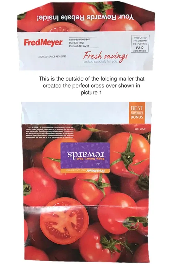
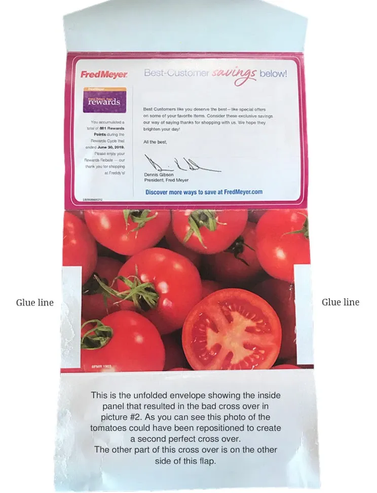
This is the flat unfolded image of picture 1. You can see the folded flap is at the top of this image, but it had to match up with the tomatoes just below the purple box (in this image). You can see where this sheet was folded into the shape of an envelope and by referencing the first picture with this one you can see where the bottom edge of the flap would land on this flat printed sheet.
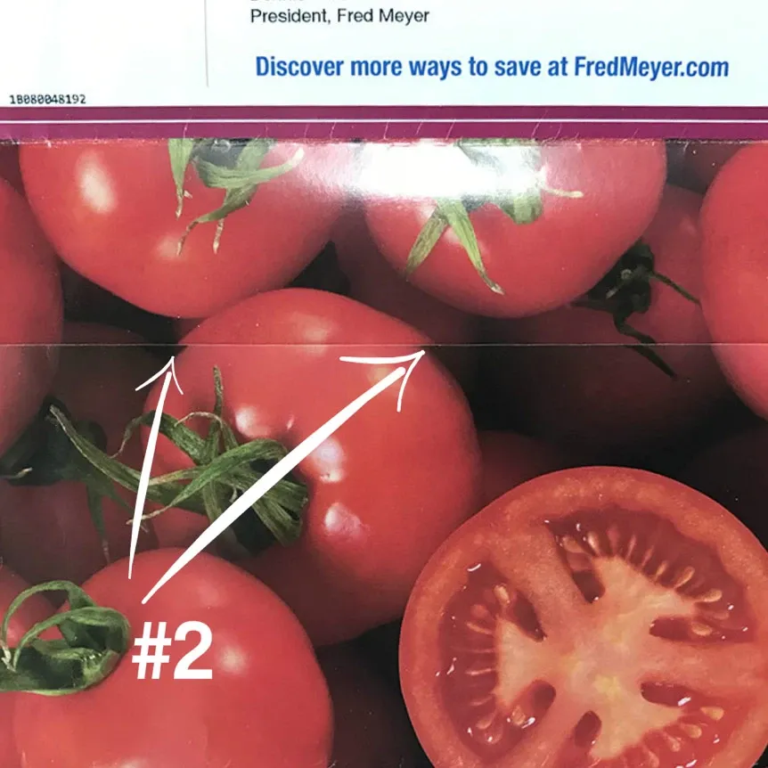
On the inside of that same envelope however, there is a cross over where the short side of the envelope folds up to meet the printed image that is on the inside of the envelope. It was intended to be a cross over but the art on the inside of the envelope was not positioned correctly so the cross over “missed”. It’s worth noting that the designer got the harder of the two cross overs (picture #1) perfect and missed the one that would have been the easiest to get right (picture #2) When you look at these pictures it will make more sense.
What this picture shows is the portion of the envelope that is folded up to create a cavity where coupons are inserted. The short flap is folded up from the bottom and the arrows are pointing at the place where that short flap edge should have lined up with the image that is printed on the inside surface of the envelope, shown in the next picture.
If the inside image had been moved down and right slightly the cross over would have been much closer, but the color is still not right either. Look at the color of the tomato at the cross over. You can see that the tomatoes in the upper image are brighter than the tomatoes in the lower image. This is another common problem with cross overs. Whether the cross over is a band of color on the top of every page of an annual report or a photographic image like this one. When the images are laid down, side-by-side the intensity of the ink should be the same. There should be no difference in the color of these tomatoes. Take another look at the tomatoes in picture #1. They are exactly the same color.
Finally, here is the flat version of picture #2. You can see that the image printed on the inside of the envelope could have been repositioned without affecting any other part of the design to achieve a second perfect cross over on these envelopes.
That was just two examples of cross overs. You can see that the use of this design technique creates many challenges. The designer and the bindery need to work together to get the desired results. Even the press operator needs to understand where the cross overs are when printing the flat sheets, so they can check the density of the color at the point of the cross over.
Press operators who know where the cross over is can use densitometer readings to confirm color correctness.
Not every design or bindery challenge involves cross overs. Sometimes the art just needs to line up with the fold in a brochure, like the roll fold brochure example mentioned earlier. Sometimes it is a stapling issue, or a crucial part of a remittance envelope that falls inside the glue line. Perforations, drilling, gluing, folding, and trimming must all be considered when developing the art. These processes are necessary to finish the product, so the accommodation must to be made in the art, not at the bindery. Again, that is a challenge because the art always comes first.
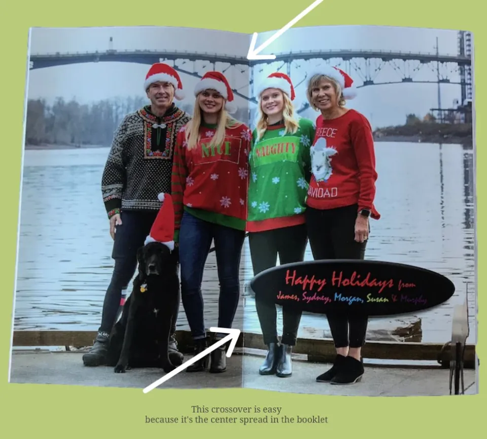
Case Study: A Booklet with a cross overs and bindery challenges. Here is a booklet showing the cross over at the center spread. This is, of course, the easiest of all cross overs because the two sides of the cross over are contiguous and on the same piece of paper, but there is only one of these in an entire booklet. The arrows point out the spine.
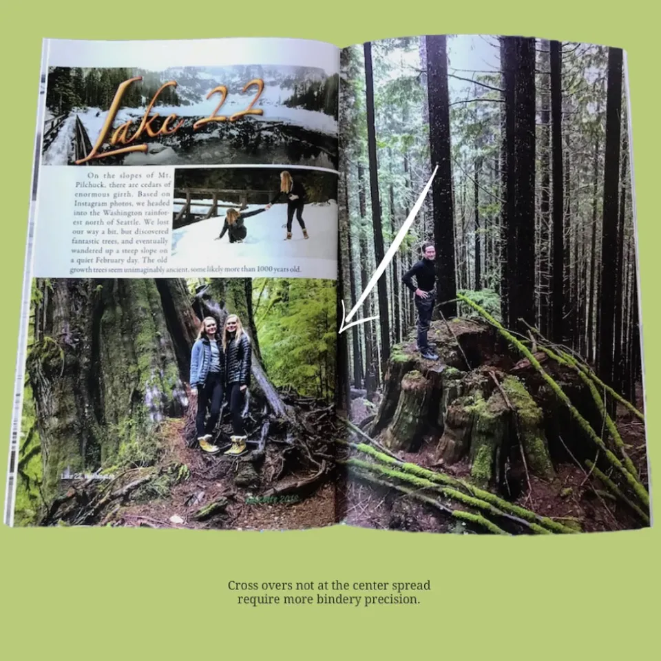
Here is a true cross over like the ones shown on the Fred Meyer envelope but this is in the text of a booklet. Getting this right requires precision bindery. All these pages are printed on large flat sheets which are first folded, then assembled as folded signatures into the correct stacks then stitched and finally, they receive a 3-side trim to create a finished booklet. There are numerous opportunities to get this wrong.
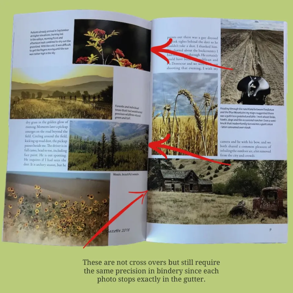
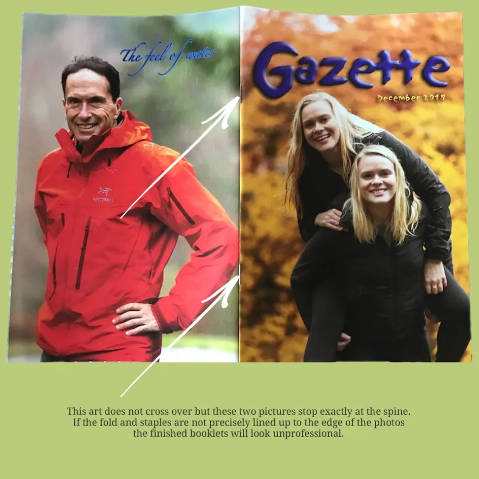
Even though these pictures do not cross over from one page to the next because they stop in the gutter the bindery challenges are much the same as a cross over. If the page is folded or stapled incorrectly it will show up as white space next to these photos or part of the photos will wrap through the spine and be visible on other pages where it should not appear. Again, this art requires very precise bindery techniques. The following picture also illustrates this need for perfection. It is the outside cover of this booklet and if the folding, stapling, and trimming are off even a fraction of an inch this finished booklet would be a very disappointing finished product. The client literally sends these booklets all over the world and he and his international contacts expect this booklet to be finished correctly, as do I. It is my responsibility to make sure all these technical issues are managed at the front end of this process, so my client and his contacts receive a high-quality printed document.
As a print buyer it’s incumbent upon you to be thinking about the end in the beginning. The type and weight of the paper, the folding, stapling, drilling, assembly, and mailing requirements of the finished document all need to be managed at the beginning of the process. I think of print buyer or broker like a general contractor on a building project. The contractor has to know about every detail of the finished building. A print buyer or broker needs to know about every detail of the finished printed document. If you’re a business owner or print buyer but you’re not technically savvy in all these issues, I strongly recommend that you hire a print broker to manage the details for you, just like you would hire a contractor to handle a remodeling project at your business. Print brokers don’t work for a print shop, they work for you. They are your advocate. Print brokers will save you both time and money and they may even save you the aggravation of a costly redo.